
Web Design Studies
Here it all began – with curiosity, a PC and a choice to learn something new. Studying web design in 1998 was my first encounter with the digital world. Without knowing it, I laid the foundation for an understanding of technology, structure and user experience that would later shape my entire professional journey.

A PC, an upgrade – and a new way of thinking
It's easy to forget how different everything was in the late 1990s. Today, technology is taken for granted. It's seamless, integrated, and always available. But it wasn't like that back then.
For me, it started with a concrete event: the purchase of my first PC – an Olivetti. It was not a strategic choice. It was a choice driven by curiosity and a feeling that something new was about to happen. The machine came with an older operating system, but with an upgrade to Windows 95. The transition from Windows 3.11 to Windows 95 was more than a technical improvement. It was a transition from the fragmented to the holistic, from the technical to the more user-friendly. Suddenly you had a graphical interface that made it possible to navigate, understand and explore in a completely new way.
This was also the period when the internet began to move from being a niche phenomenon to becoming something more people could access. Access was slow. The connection was unreliable. The sound of the modem connecting was part of the experience. Still, there was something about it that made an impression.
It wasn't just technology. It was a new way of communicating. A new way of sharing information. A new way of thinking.
This is where the seed was planted.
The study – learning what had not yet been named
Alongside my full-time job as a marketing consultant at SAS EuroBonus, I chose to start a web design course in 1998. Not many people did it at the time. There was also no clear career path related to this area. But that's exactly what made it interesting.
The study was practically oriented, and it was clear from the start that this was not about theory alone. We were going to build. We were going to test. We were going to understand how digital surfaces actually worked.
What is striking in retrospect is that we learned something that at the time did not have a clear professional language. We did not learn “UX”. We did not learn “interaction design”. We did not learn “digital user journeys”.
But we worked on all of these things.
We learned how a page must be structured to make sense. We learned how the user must be guided through a solution, without getting confused. We learned how visual elements affect understanding and experience.
It was a learning experience that was concrete, practical and directly related to what we actually made.
The tools – the craft behind the first websites
An important part of the study was working with software. Not as a support tool, but as the very entrance to understanding the digital craft.
Through image processing in Photoshop, we learned how visual expressions could be shaped. We worked with colors, contrasts, composition and adaptation to the screen. These were not just aesthetic choices. It was about how information appears, and how the user perceives what is presented.
At the same time, we worked on the actual construction of the websites. Everything had to be built manually. There were no ready-made solutions that took care of structure or navigation. Every page had to be planned, every link had to be set up, and every context had to be understood.
This created a completely different kind of closeness to what you were developing. You couldn't hide behind systems. You had to understand what you were doing.
Animations were also used as part of the expression. At the time, this was a relatively new element, and it required a conscious approach. Too much animation created noise. Too little made the solution static. Balance was crucial.
It was in this work that understanding began to emerge:
It's not about what you can do technically – but what you should do for the user.

Case work – when everything has to work together
One of the most demanding, but also most educational elements of the study was the work on the practical case study. We were tasked with developing a complete web solution for an imaginary furniture company – a task that initially appeared to be relatively simple, but which quickly turned out to contain far more dimensions than initially thought.
It was in this work that theory – or what we thought was theory – met reality. Suddenly it was no longer about individual elements such as images, text or structure in isolation. It was about how all of this would work together, simultaneously, in one holistic solution.
The design had to be not only visually appealing, but also help the user intuitively understand where he or she was. The structure had to be logically structured, but at the same time flexible enough to handle different types of content. The navigation had to be so simple that it did not require explanation – and at the same time so clear that it could not be misunderstood.
A realization arose along the way:
It's not the individual elements that determine the quality of a digital solution. It's the interaction between them.
The work also required an awareness of prioritization. What is most important? What needs to be done first? How do we guide the user forward without overloading the page with information? We didn't necessarily have a ready-made language for these questions, but we worked on them – concretely, practically and continuously.
The feedback on the solution confirmed that this whole thing worked.
The description of the solution as “beautiful and good” was important in itself, but perhaps even more interesting was what lay behind the formulation. It wasn’t just about aesthetics. It was about balance. About control. About understanding.
The fact that the animations were perceived as entertaining without being disruptive shows an early understanding of something that is absolutely central today:
That instruments should support the experience – not dominate it.
The fact that the menus were described as neat and clear points directly to the ability to structure information in a way that makes sense to the user.
This was no coincidence. It was the result of work, reflection, and a growing understanding of how digital solutions actually work.

The insight – what we learned without knowing it
When one looks back on this study using today's terminology, it becomes clear that the learning went far beyond what was explicitly formulated in the teaching.
We didn't just learn how to create websites. We learned to understand how people encounter digital surfaces.
It happened gradually, almost imperceptibly. Through small adjustments. Through trial and error. Through the experience of what worked – and what didn't.
-
We learned that a poor structure creates uncertainty.
-
We learned that unclear navigation creates frustration.
-
We learned that good design is not only pretty, but understandable.
These are insights that today are the very foundation of disciplines like user experience and interaction design. But at the time, these were not defined as separate disciplines. It was not something you could read about in the same way. It had to be experienced.
It is precisely this type of learning that often leaves the deepest mark: the kind that comes not through theory alone, but through experience.
In retrospect, this appears as a form of “tacit knowledge” – an understanding that is embedded in the way one thinks, without necessarily being formulated in clear concepts.
It is also here that we see the beginning of something that has later become a common thread in your work:
The ability to see the whole, not just individual components.
Relevance – from 1998 to today
When you look up and see the development from 1998 to today, it's easy to be overwhelmed by how much has changed. Technology has developed at a pace few could have predicted. The tools have become more advanced, more accessible and far more user-friendly. But at the same time, there is something that has not changed.
The basic principles stand.
Today, you can create a website in a few hours. You can use ready-made templates, automated solutions and advanced publishing systems. Yet we see time and time again that many digital solutions do not work as they should.
Why?
Because it's not the technology that determines quality. It's the understanding.
What we learned in 1998 – about structure, navigation and user needs – is still the foundation for good digital solutions. The difference is that complexity has increased. Users expect more. Choices are more numerous. Competition for attention is greater.
In such a reality, the basic principles become even more important.
It's not enough to be online.
You have to function online.
This is a distinction that is still not clear enough in many businesses, and this is precisely where this early experience provides an advantage. It provides an understanding that does not depend on tools, but on principles.

The foundation – the start of a professional direction
When viewed in a longer perspective, it becomes clear that this study represents more than a single learning period. It is the start of a direction – a professional orientation that has subsequently been further developed through experience, study and work.
What was established here wasn't just skills. It was a way of thinking.
A way of approaching problems, where one seeks to understand connections before finding solutions. A way of working, where structure and user needs take precedence over technical possibilities. A way of assessing quality, where the whole weighs more heavily than individual elements.
This is an understanding that has proven to be robust over time. It has withstood technological shifts, new platforms, and new ways of working.
It is also this understanding that underlies the perspective that value is created in interaction. Not in isolated measures, not in individual projects, but in the encounter between people, technology and organization.
Studying web design in 1998 was perhaps not intended to be the start of a long professional journey. But that's exactly what it turned out to be.
Not because the technology was advanced.
But because the understanding that was developed proved to be lasting.

When chance opened the door
When I finished my web design degree, I didn't really have a clear plan for how I would use my skills in practice. There were few established roles in this field, and the path forward was not obvious.
One day I was sitting in the canteen at SAS in Fornebuveien with the then marketing manager, Thomas Havnegjerde. In an informal conversation, he asked what I did outside of work, and I told him that I had recently completed a web design degree.
He reacted immediately and asked if I had seen that SAS Norway had advertised a position as an Internet manager. I hadn't.
The conversation made me aware of an opportunity I otherwise wouldn't have picked up on. I applied for the position through the regular recruitment process, and shortly after, I was offered the role.
What had until then been an interest and a study outside of work suddenly became a new professional direction.
But it didn't stop there.
Just a week and a half after I started in the role, Thomas approached me again. He told me that I would be participating in a large project in Stockholm – a project that would develop the first commercial web solution for SAS. It would involve a lot of travel, and it would be a long-term job.
It was the start of something far bigger than I could have imagined at the time.
For a year and a half I commuted to Stockholm. Every Tuesday morning I would travel to SAS’s headquarters in Frösundavik, returning on Wednesday. There, at the SAS Royal Hotel in Frösundavik, we sat together – a Nordic team – and worked intensively with suppliers to develop what would become one of the company’s first digital initiatives.
It was a time of pace, learning and close collaboration. Together with skilled and committed colleagues from Sweden and Denmark – including Ola Strangeways and Christian Mejlvang – we built not only a solution, but also an understanding of what digitalization could be.
It wasn't just a journey in the physical sense. It was a journey into a profession. A journey that started with curiosity, continued with a degree – and which, through a seemingly random conversation in a cafeteria, developed into a career that has lasted to this day.

From studies and seminars to today's professional universe
The studies, seminars and field trips documented on this page are part of the knowledge base behind The Invisible Capital. Topics such as customers, technology, innovation, digitalization and value creation have followed developments over several decades – but the disciplines have also continued to develop.
At The Invisible Capital, we are therefore continuing to work on these questions in our own subject series. Here, we connect previous theory, research and experiences with newer knowledge, new technologies and today's challenges for people and businesses.
Innovation
Innovation is not just about new ideas. Value is created when knowledge, technology and ideas are developed into products, services, processes, organizational forms and business models that are actually used. The series on innovation goes from Schumpeter to modern innovation research and covers, among other things, incremental, radical, disruptive, open and user-driven innovation.
→ Explore the Innovation Series
The customer
The customer is not just the recipient of what the business produces. In a competitive market, the customer is a crucial determinant of whether the business actually succeeds in creating value. The series about the customer goes deeper into customer orientation, customer insight, customer experience, satisfaction, loyalty, trust and the encounter between people.
→ Read the subject series about the customer
Value creation
What does it really mean to create value – and who creates it? The series on value creation moves from economic theory and key researchers to a broader understanding of how people, expertise, institutions, businesses and the public sector contribute to value creation.
→ Read the series on value creation
Digitization
Digitalization has evolved from stand-alone technologies to a fundamental part of how businesses work and create value. The Digitalization from A–Z series follows the development through internet, web, e-commerce, search, UX, social, mobile, omnichannel, cloud, data, platforms and digital transformation – up to today’s AI First development.
→ Read the series Digitization from A–Z
Artificial intelligence
Artificial intelligence represents the next chapter in digital evolution. In our own AI universe, we investigate how artificial intelligence works, how AI finds and uses information, how it evaluates sources and websites, and what the development can mean for people, businesses, and value creation.
→ Go to the articles about artificial intelligence
Recommended literature
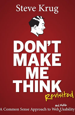
Don't Make Me Think
One of the most influential books on usability and web design, Steve Krug explains how simple navigation and intuitive solutions create better digital experiences for everyday people. The book became an early reference in modern web design and remains highly relevant today.


